
SOFAR SOUNDS IOS APP - USER RESEARCH
Note: All screens to the left are from the current release of the Sofar Sounds iOS app, not the tested prototypes.
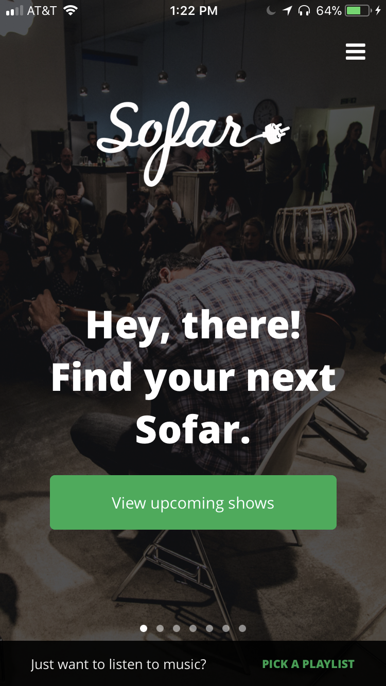
Sofar Sounds is a global music community connecting concertgoers with up-and-coming bands in intimate venues. In 2016 and 2017, I performed user testing sessions with users in San Francisco and Chicago to provide localized feedback on prototypes of the Sofar Sounds iOS app.
What problem were we trying to solve?
Veteran and potential Sofar Sounds concertgoers only had two options through desktop and mobile to consider joining the community, commit to shows, and relive their experiences. The Sofar team in London developed prototypes in Marvel and Principle and I was tasked with conducting user testing sessions and synthesizing feedback.
What were we testing for?
Our research focused on testing features related to users considering attending a show, committing to attending a show, and championing Sofar Sounds as a repeat concert goer.
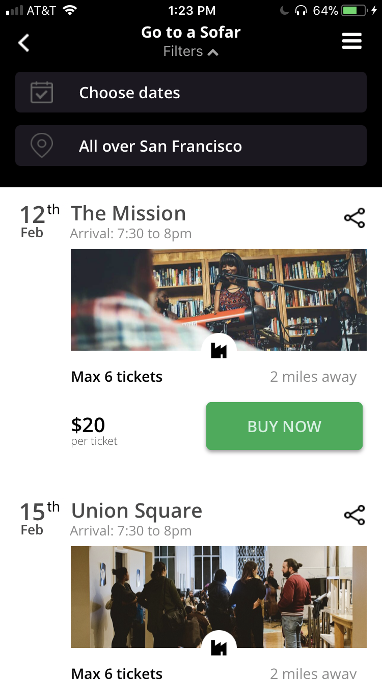
Considering:
- Finding a nearby gig
- Planning in advance
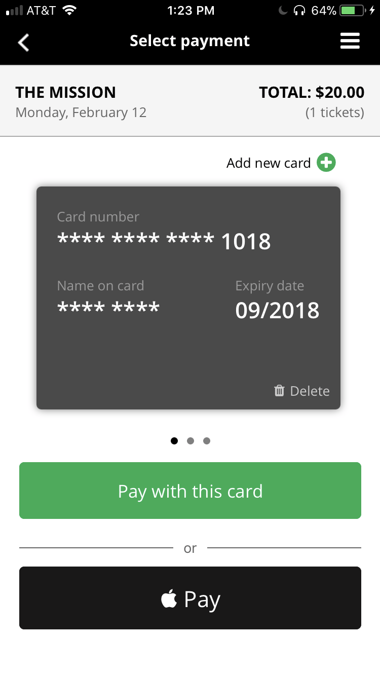
Committing:
- Attending a gig
- Purchasing a ticket
Championing:
- Reliving the Sofar experience
- Discovering artists
How did we do it?
Participants were selected in Chicago and San Francisco based on a diverse mix of factors such as:
- Age
- Gender
- Tech savviness
- Whether or not they had seen a Sofar show
- Level of interest in music
- Musical taste
- Appetite to try new experiences
While I asked users to generally interact with the prototype, I also had users test specific user flows. We focused on the features listed above.
What were they saying?
Pain points included:
- Features
- Homepage had too many features cluttering the screen
- Ability to see catalog of past shows you had attended
- Lack of meaningful artist information within app
- Usability
- Undiscoverable interactions
- Inconsistent navigation
- Cumbersome profile set-up (i.e. giving date preferences, location preferences, etc.)
- Content
- Copy was not localized (London based design team used British terminology - i.e. gig vs. show or event)
- Unclear content on how the service worked
Positives included:
- Features
- Location-based show discovery was how the user wanted to discover shows
- Simple sign-up and payment flows
- Easily accessible way to view purchased tickets
- Usability
- Enjoyable animations to signify that an interaction had occurred
- Perfectly sized touch targets
- Clear visual hierarchy
- Content
- Fun copy
- Engaging calls to action
- Useful tips at bottom of the screen
How did it turn out?
Research was synthesized by the team in London and used to inform special localized releases of the Sofar app. Much of the feedback directly affected tweaks to features, usability, and content.
The app is now available on iOS and Android in the US and Europe and continues to bring engaged users to Sofar shows.